I spy, Ophthalmology

Enhancing the wayfinding experience for 72,000 annual visitors to the Eye Department.

Timeline

2022 - 2024

Team

Mater Ophthalmology
Mater Estates
Mater IMS Department
Hospital Volunteers 

Partners

NCAD
Flynn Signage
People walking pas the Eye Department Units B, C and Eye Emergency at the Mater HospitalL. The Eye Department at the Mater Hospital is denoted the yellow color. Follow the yellow signs to the Eye Department

Challenge

Each year, over 72,000 patients attend the Mater Ophthalmology Department — accounting for one-fifth of the hospital’s footfall. 

The department has gradually expanded into three core locations, making navigation difficult. Patients rely heavily on appointment letters and hospital signage that often feature small fonts, inconsistent naming, and outdated maps.

These issues were particularly challenging for patients with mild to moderate visual impairments, who make up a significant proportion of visitors. 

These shortcomings led to repeated requests for help, with many patients arriving at their appointment feeling anxious.
Letter before project implementationLetter after project implementation
Before
After
Entrance to DRT Clinic and Eye Emergency before project implementationEntrance to DRT Clinic and Eye Emergency after project implementation
Before
After
Shinny signage before project implementationNew signage post implementation, on Matt background and with signposting to the Eye Department
Before
After
'I step outside my office and see lost people.'
Staff member, Ophthalmology Department

Solution

Launched in September of 2024, the project reimagined the patient wayfinding experience, drawing on best-practice guidance from the NHS (2005) and Network Rail (2020).

 Key interventions include:
  • Accessible location names: “Ophthalmology” became “Eye Department,” and areas renamed are Eye Unit A, B, C, and Eye Emergency. This allowed for larger fonts supporting visually impaired users and meeting bilingual requirements under the Official Languages Act 2021.
  • Redesigned appointment letters: A new “address-style” layout  (e.g. Eye Unit A, Level 0, McGivney Wing) improves clarity. With support from IMS, letters now use a minimum size 13pt font, reduced clutter and include full colour maps featuring key landmarks and photos.
  • High contrast signage: Signage was simplified and redesigned, featuring a yellow and black design to maximize legibility for visually impaired patients. The design integrates with the hospital’s existing signage systems. A ‘yellow brick road’ leads patients directly to the Eye Department. 
  • Color-coded landmarking: Wing transitions and entry points to the Eye Department use colour cues to support orientation and reduce cognitive load.
New patient letter trialed for the project, Locational information is more prominent than before. People walking past new signage for the Eye Department
People walking past new signage for the Eye Department
New yellow signage at Eye Unit A
New signage and yellow painted landmarking on the link corridor for Eye Department.Entrance to Eye Unit C, featuring large accessible yellow sign.Poster and awareness campaign for the Eye Department locational renaming and signage implementation.
Menu awareness campaign at the canteen in The Mater Hospital, Dublin for the Eye Department locational renaming and signage implementation.
Signage on entry to the link corridor at the Mater Hospital in Dublin, directing users of the hospital to Eye Units B, C and Eye Emergency as well as Mater PET / CT centre, Breast Health , The Misericordiae Wing and Exit to Eccles Street.
Key Insights
78% reduction in patients finding it ‘difficult or very difficult’ to find the way to the Eye Department.
(Pre: 40% | Post: 8.5%)
71% of staff report being asked for directions less often - saving hundreds of staff hours annually.
90% of patients now report feeling ‘happy’ or ‘relaxed’ when they arrive at the Eye Department. 
(Pre: 55% | Post: 90%).
Survey sample sizes:

Patient surveys:
pre n=68
post n=70 

Staff surveys:
pre: n=37
post: n=38

‘I thought the signs were helpful, I just followed them and knew where to go’ 

Patient - Eye Department

‘I’m definitely not having to direct as many people’ 

Staff member - Eye Department

‘A nurse offered to help me find me way but I didn’t need their help because I had my map’ 

Patient - Eye Department 

Process

This challenge was first explored during the Mater-NCAD Design Week (2018). Four design students conducted interviews and a ‘bodystorming’ exercise - navigating the hospital while wearing empathy glasses that simulate various visual impairments (e.g., glaucoma).

In 2022, Mater Transformation, supported by NCAD resumed the project in a post-COVID context, uncovering new insights. Co-design was central: staff, patients and hospital volunteers were engaged in testing and providing their feedback throughout. 
  • 67 patients contributed their feedback through interviews.
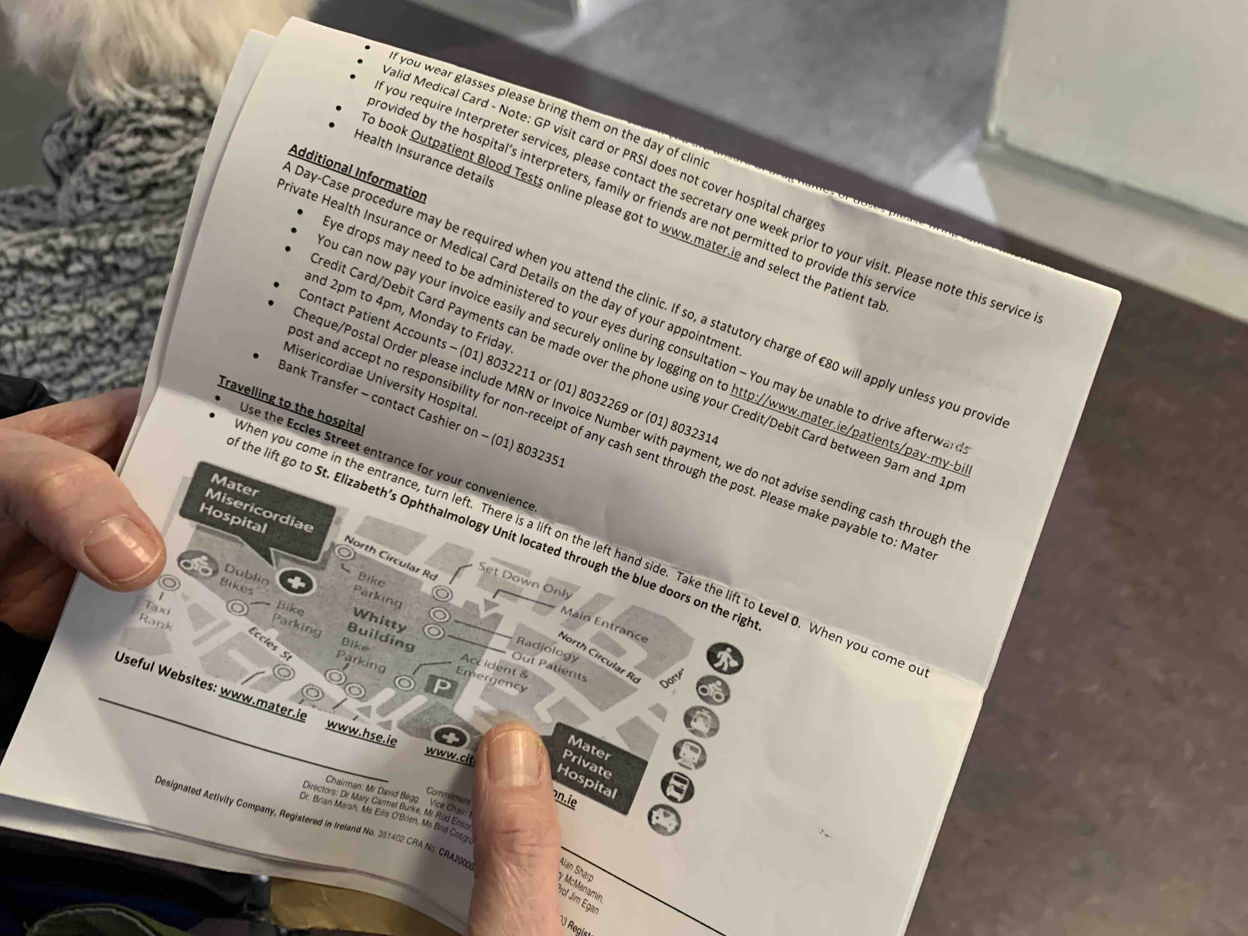
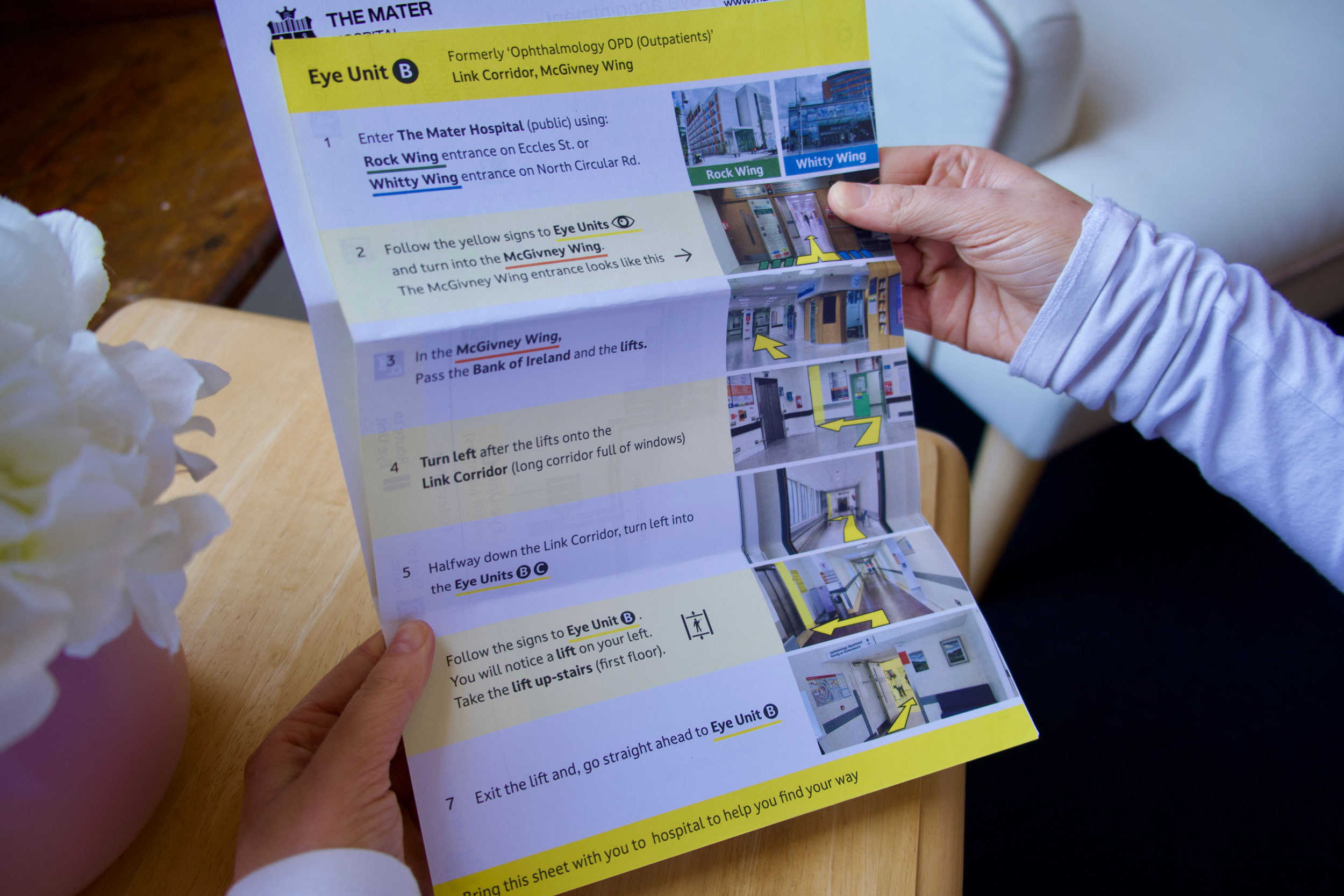
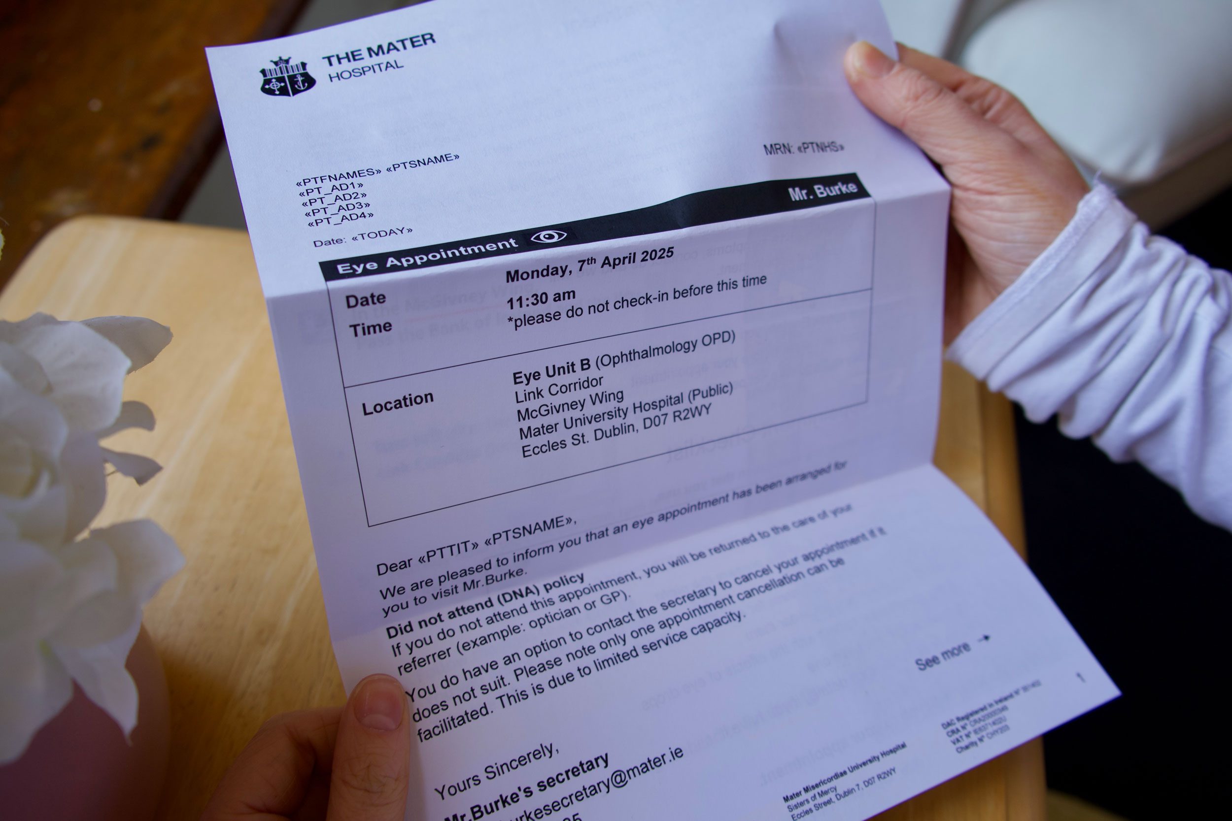
  • Paper prototypes of signage, letters and maps were iteratively tested with users.
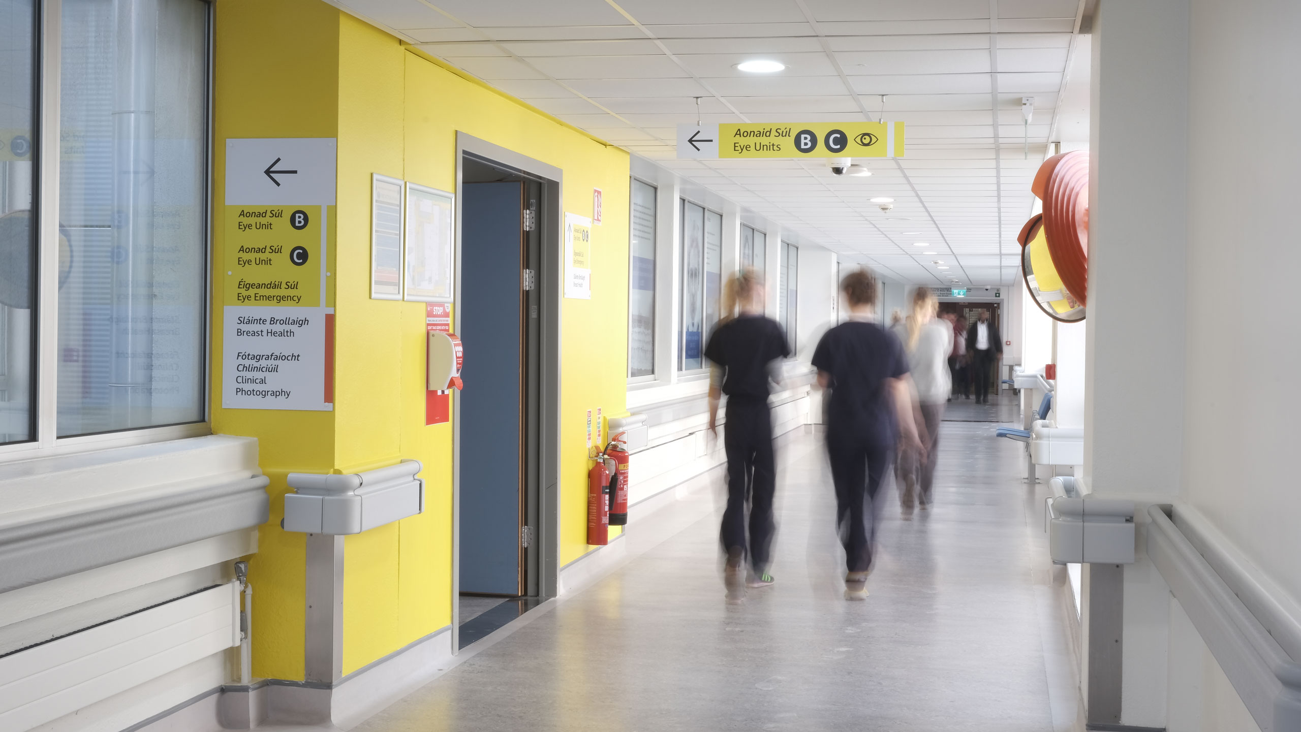
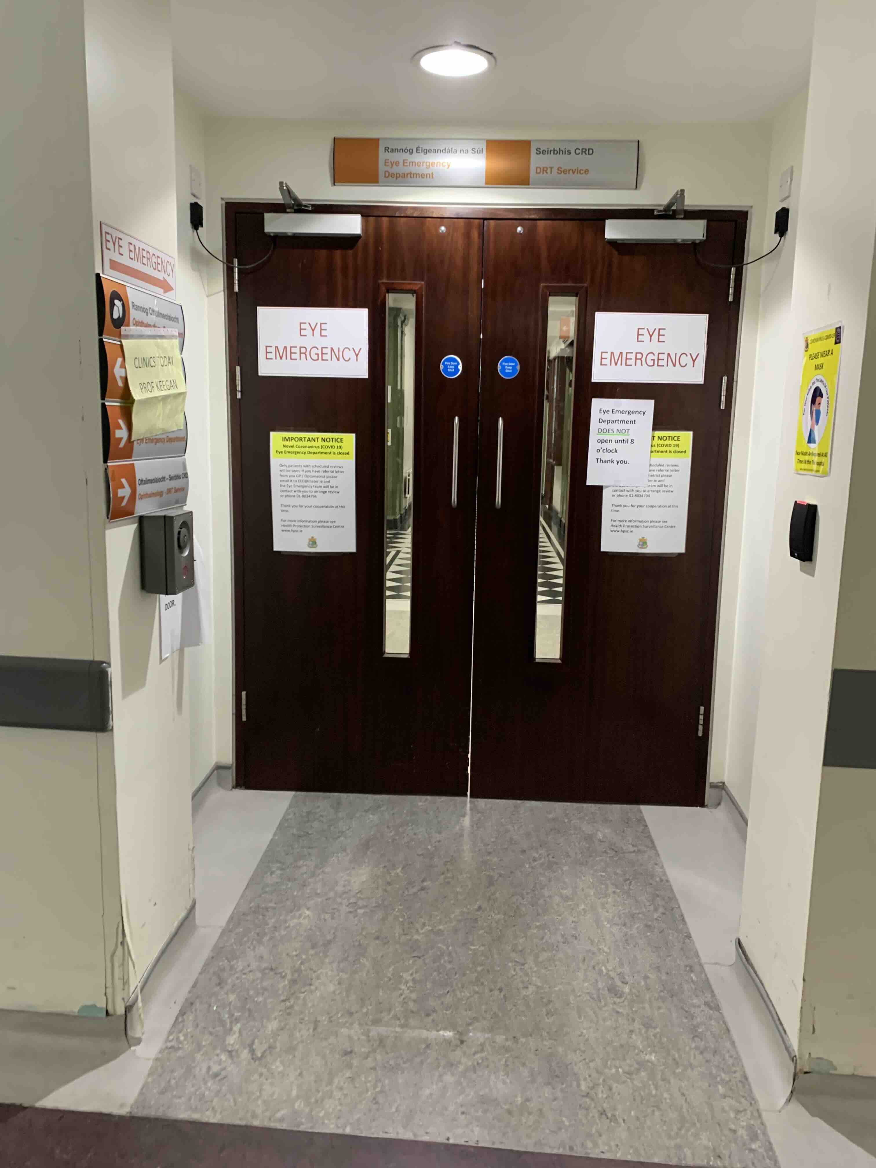
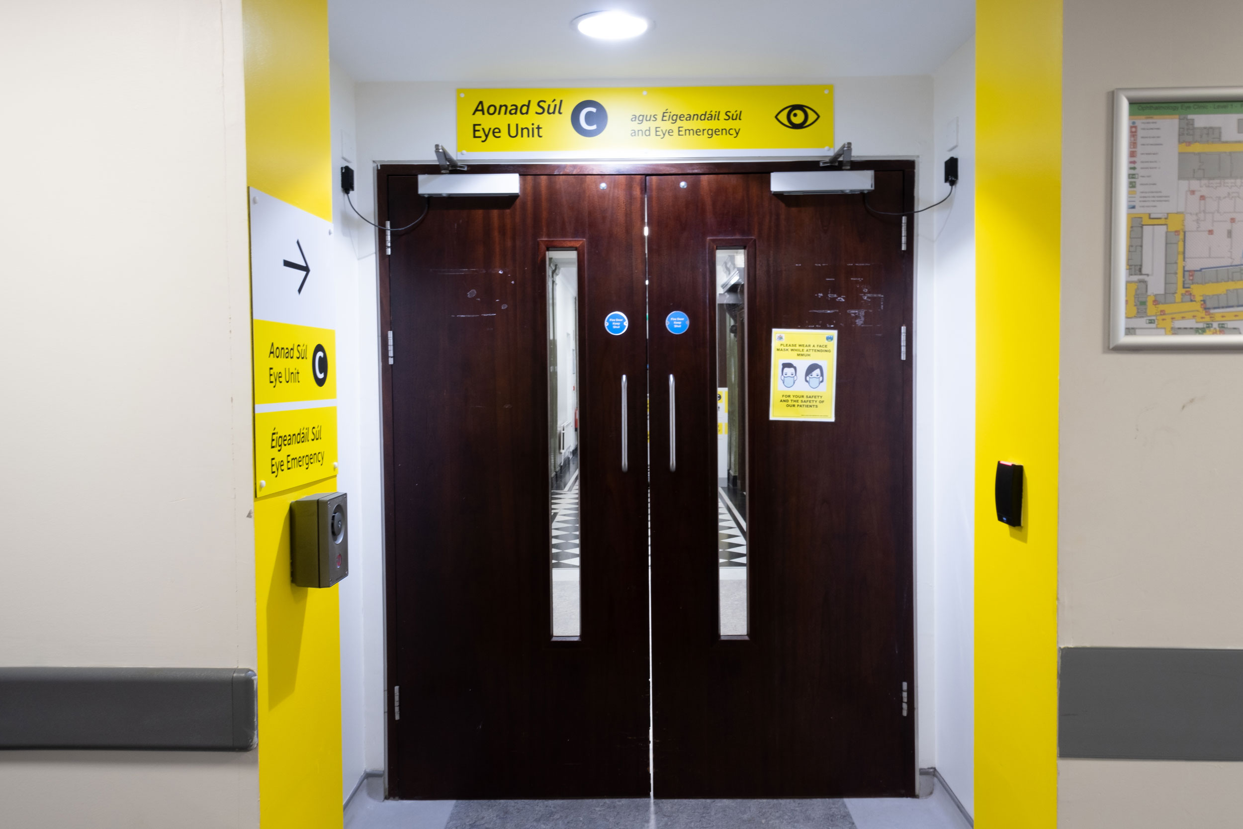
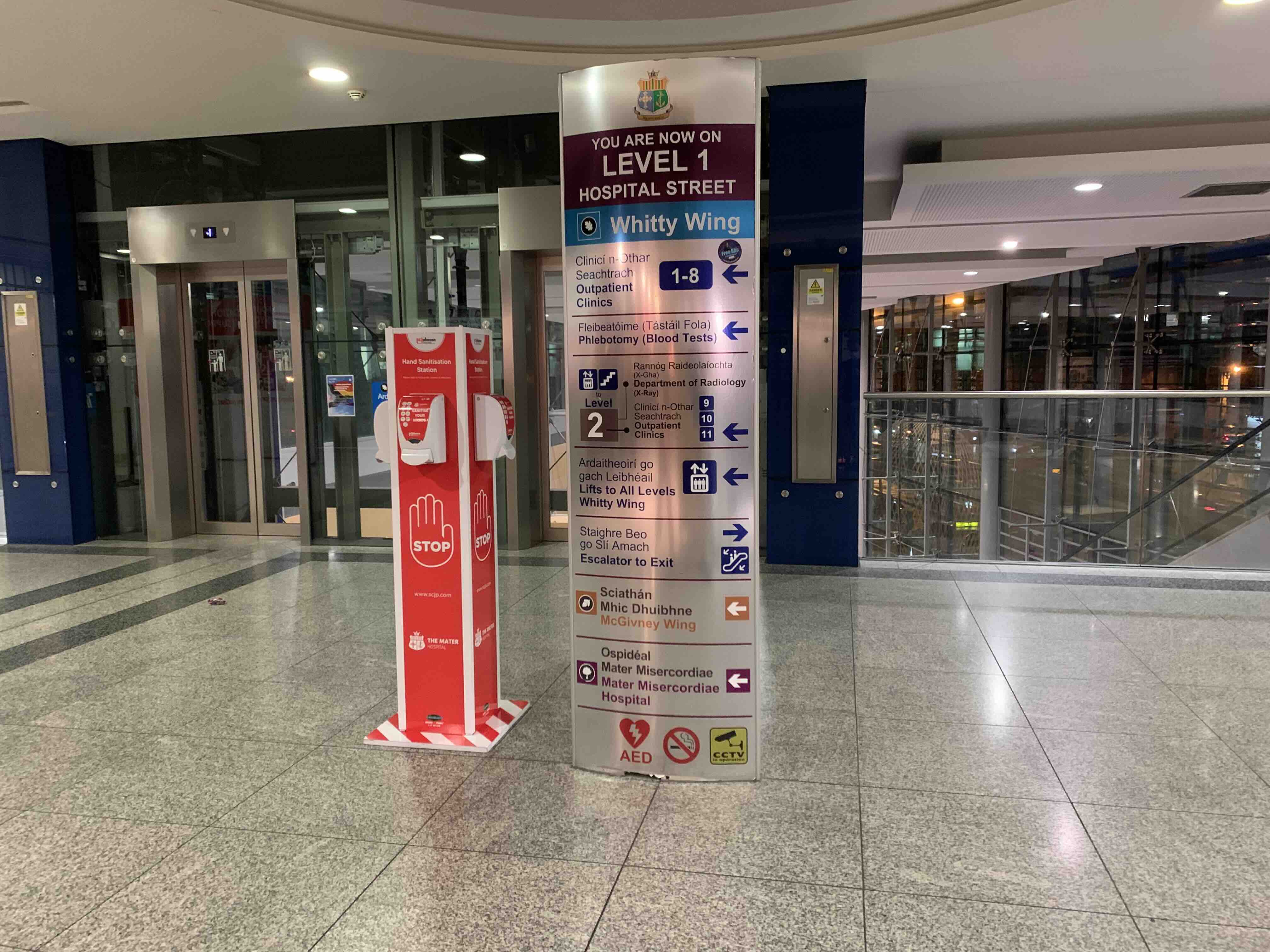
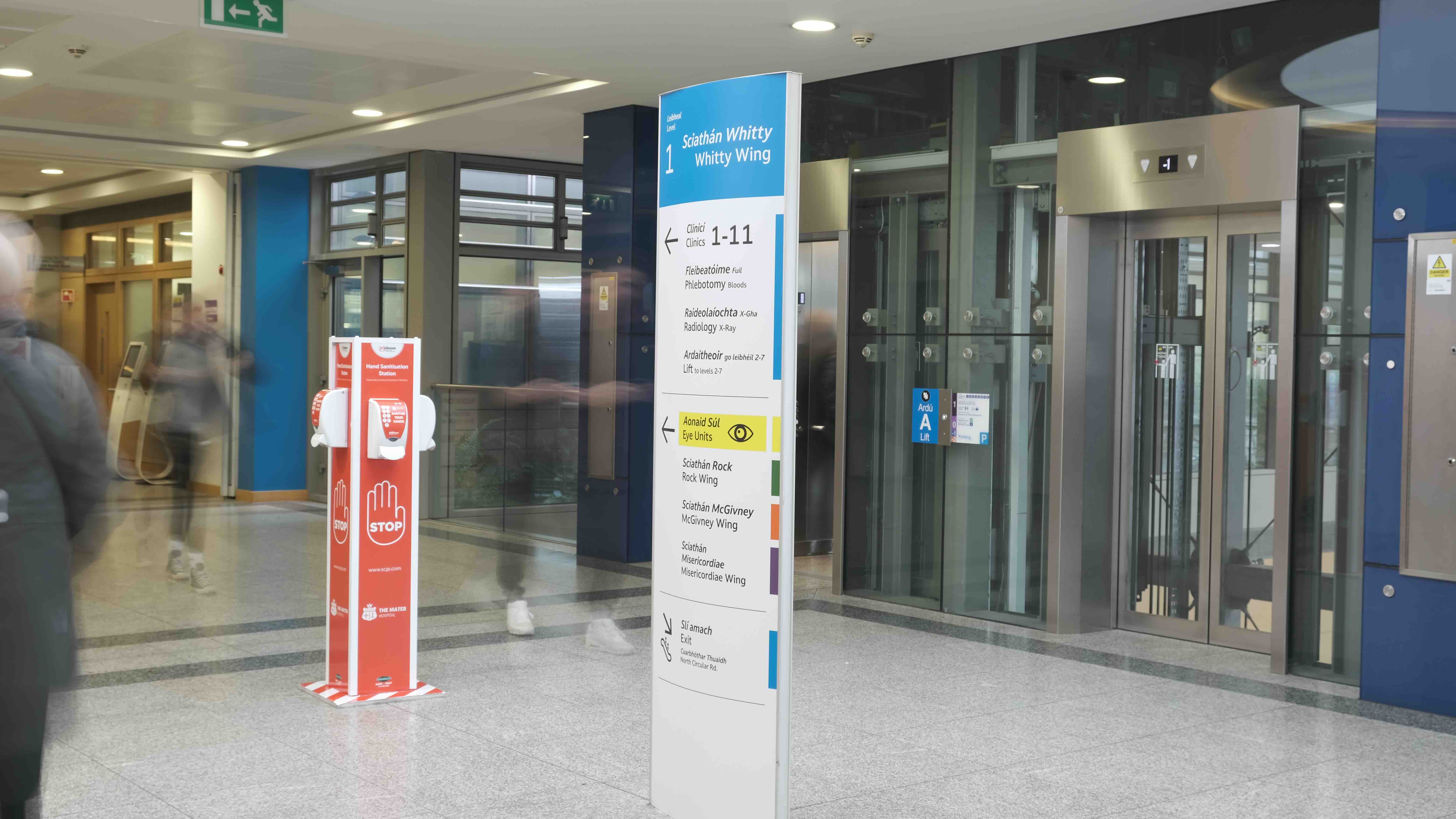
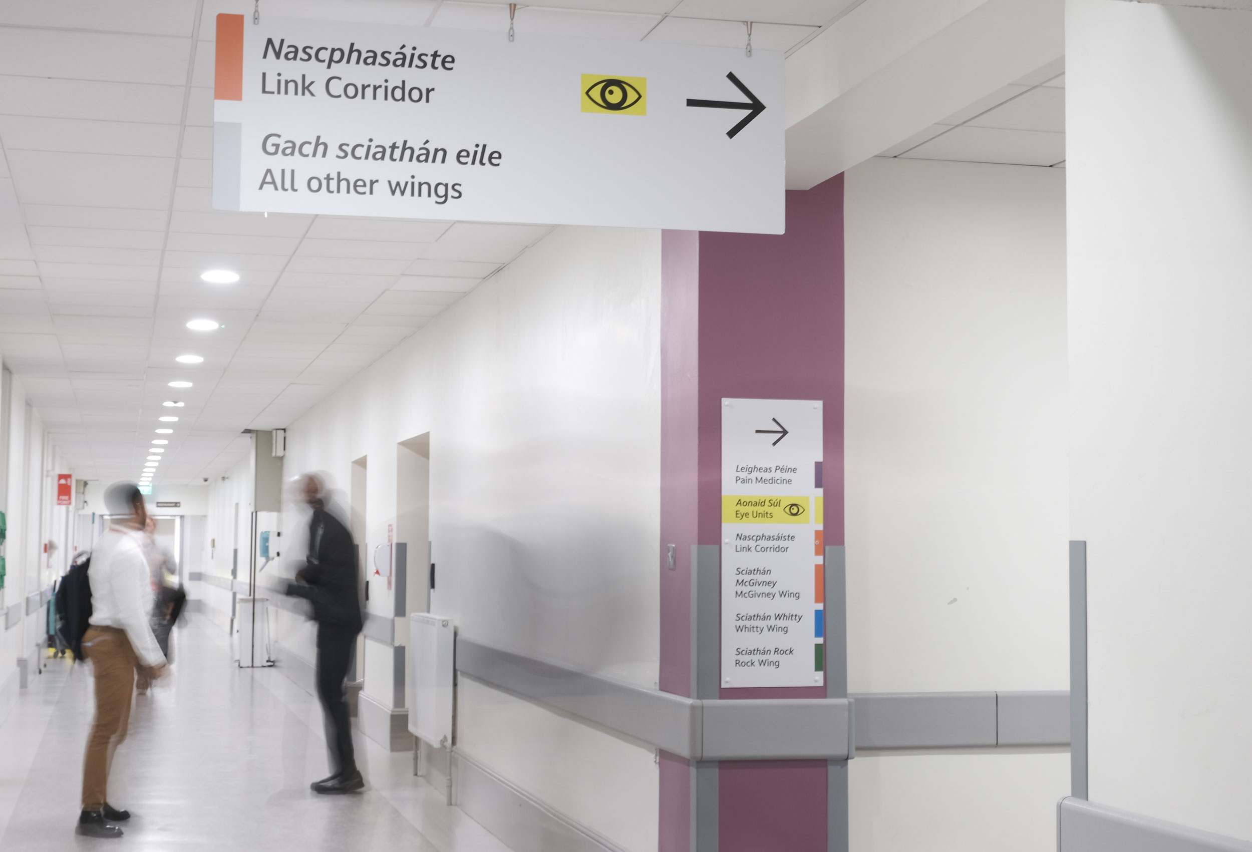
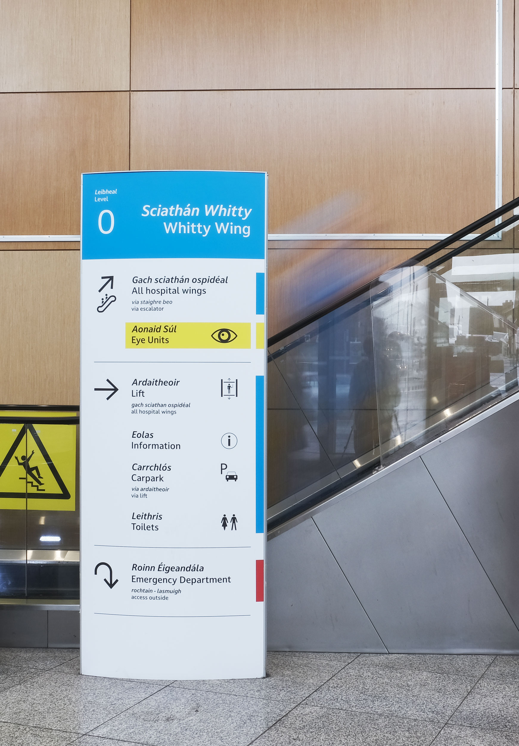
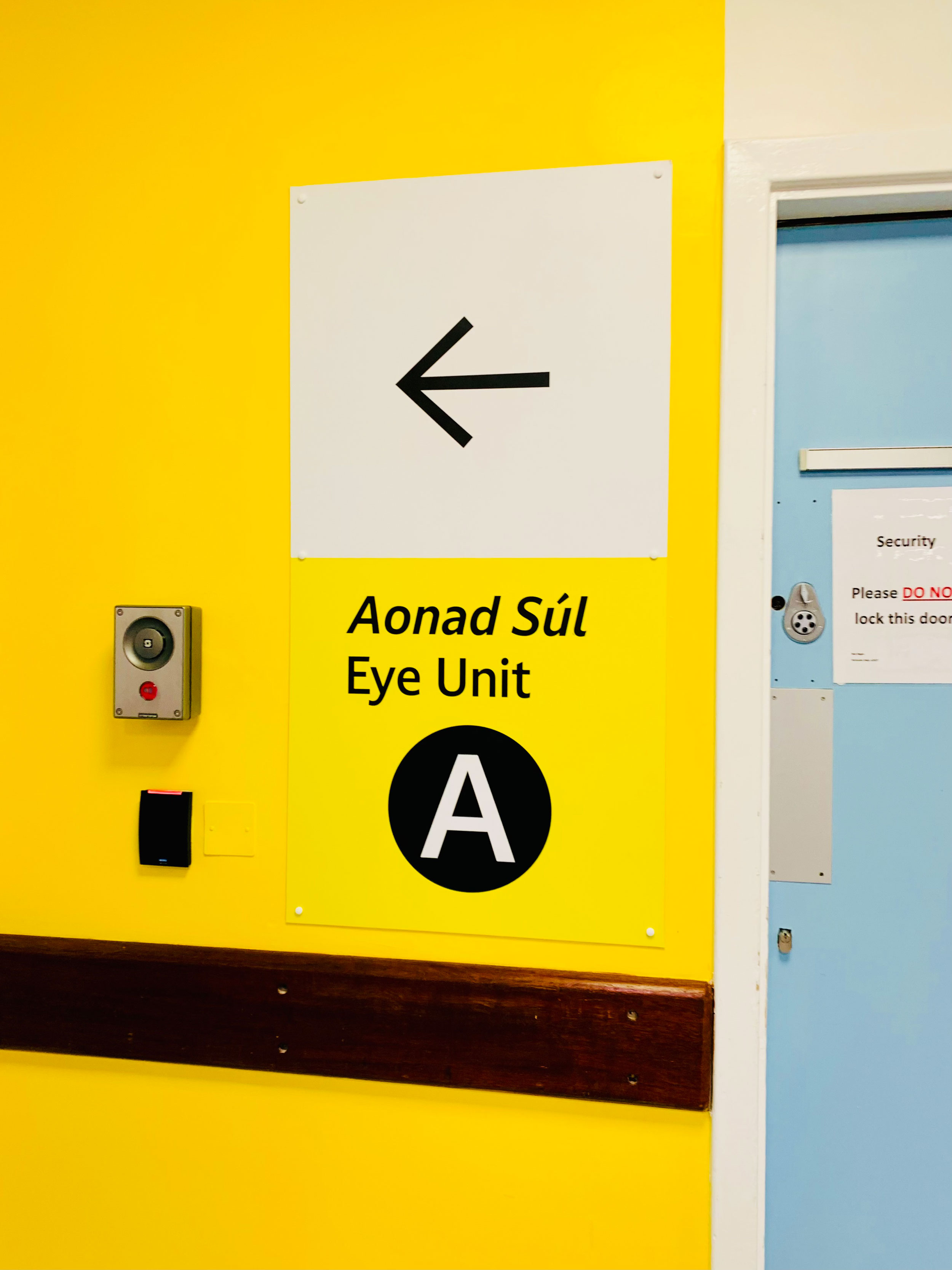
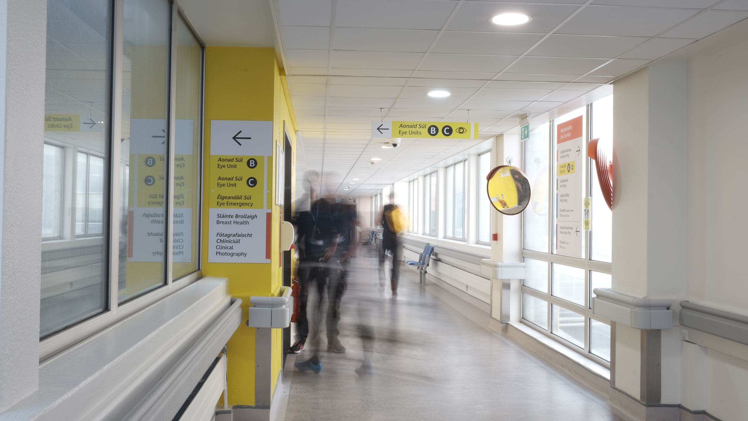
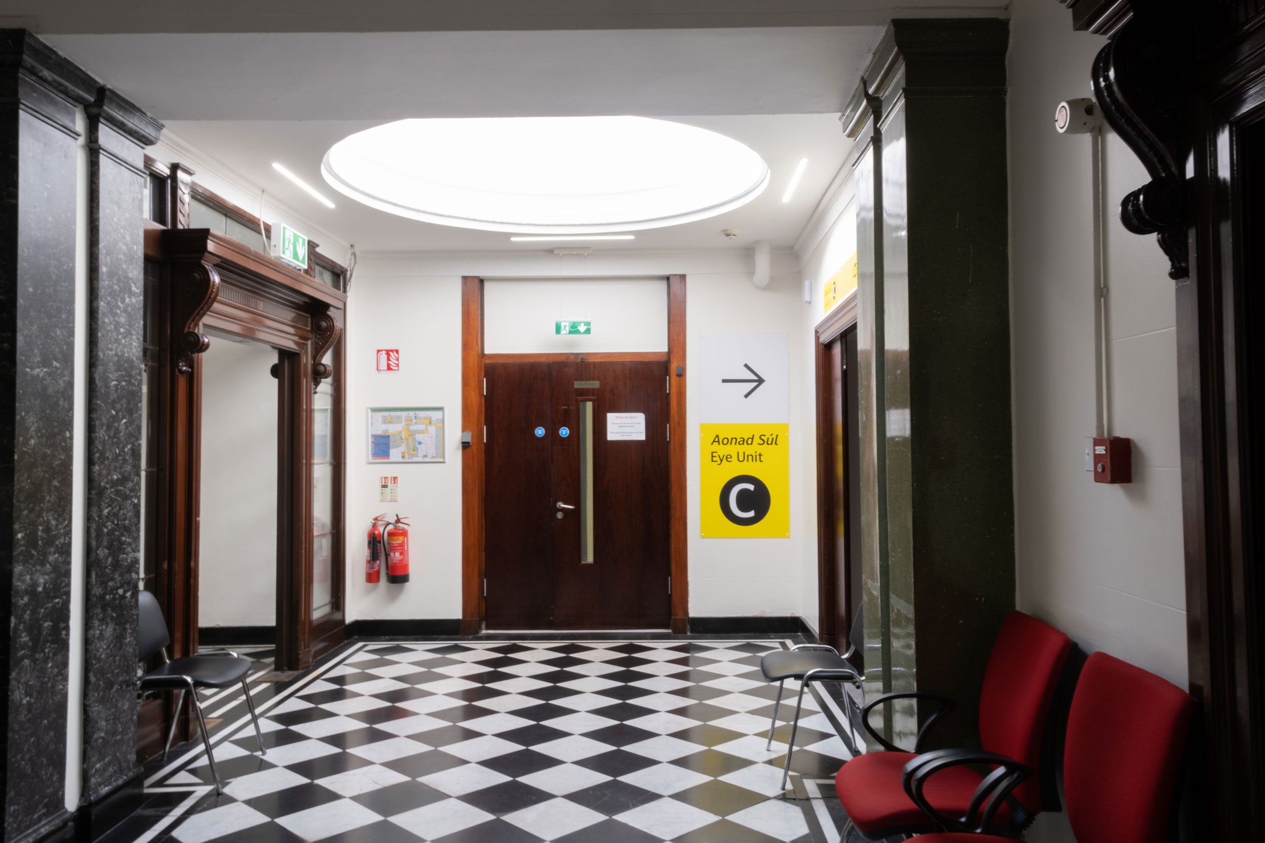
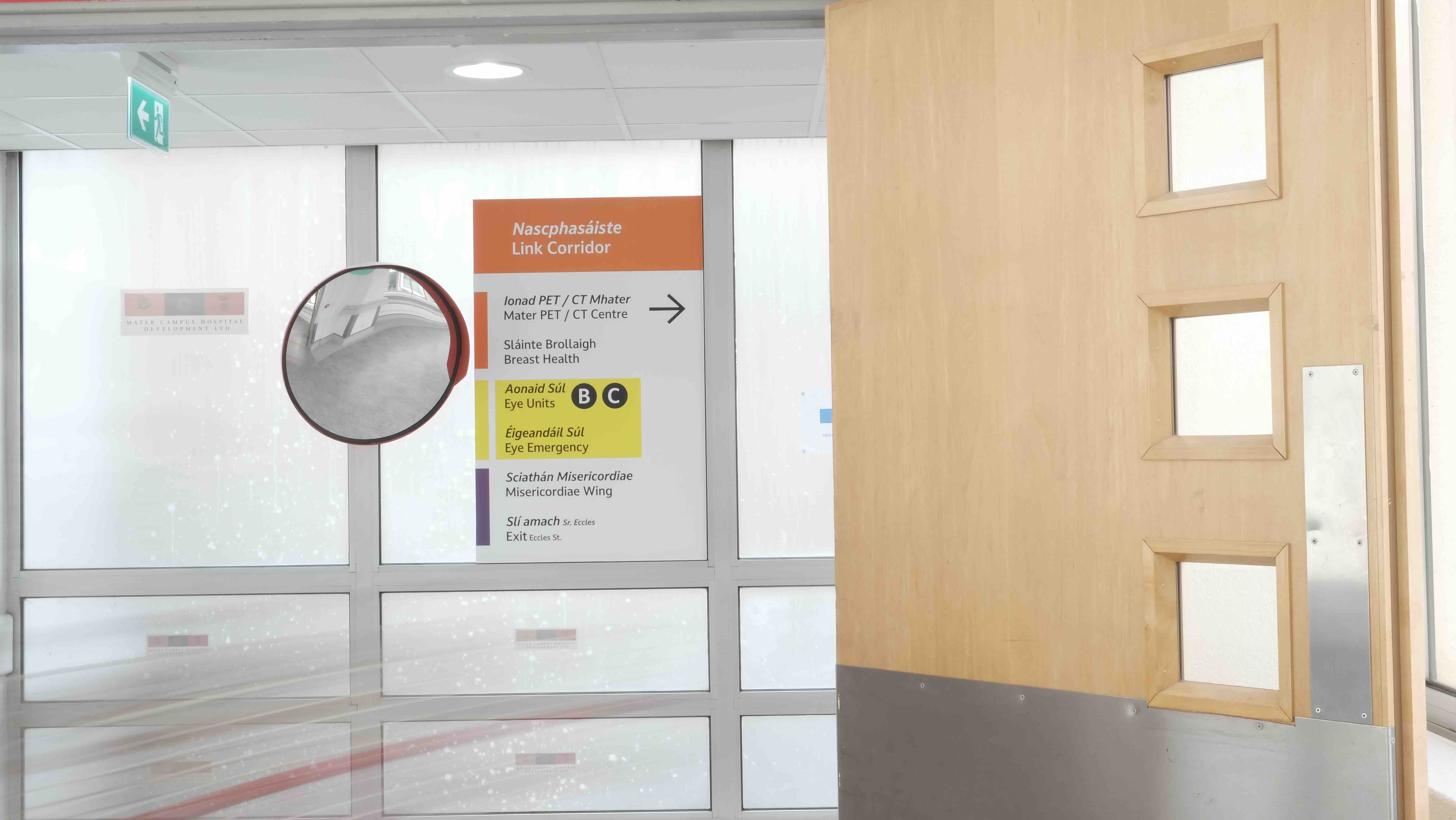
  • Solutions were tailored to fit the hospital’s vernacular signage system while meeting the needs of visually impaired users.
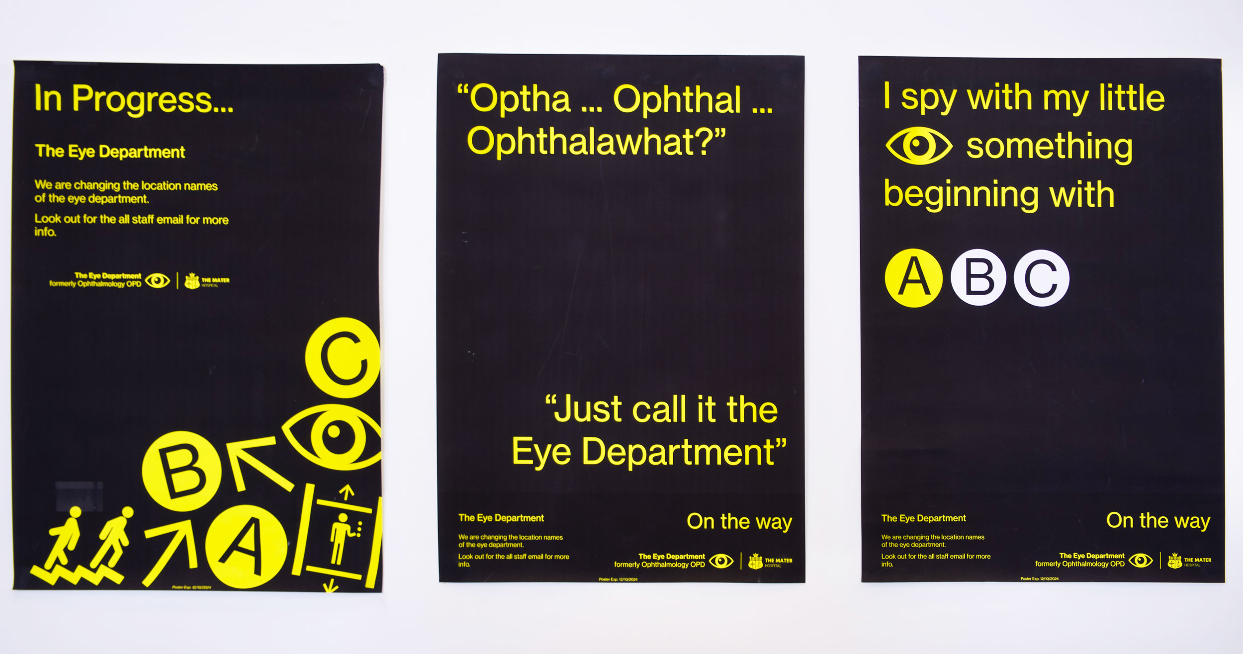
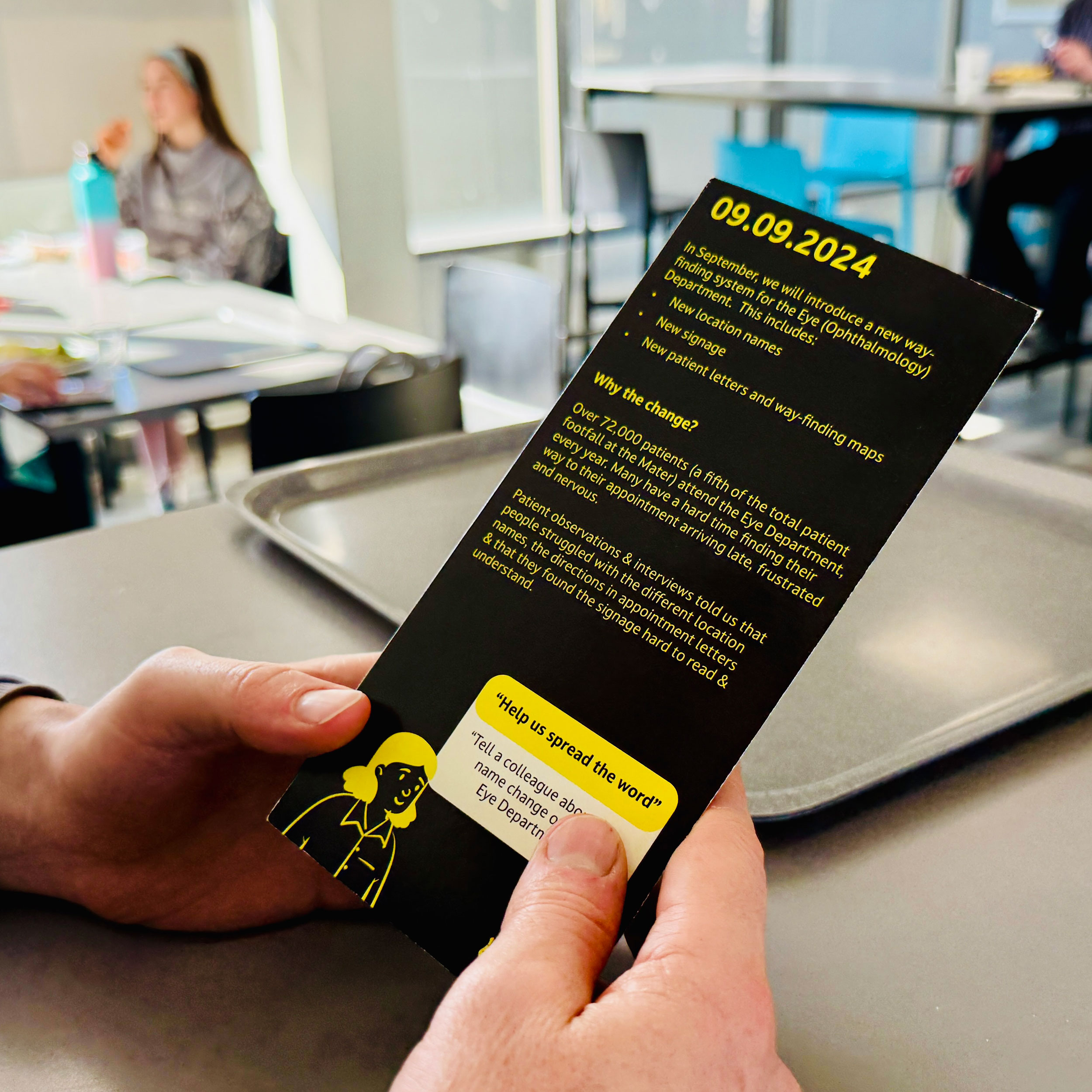
Close collaboration with Estates, IMS and Flynn Signage ensured designs were implemented smoothly – from signage installation to revised letter templates and internal communications campaigns. 

This project demonstrates how thoughtful design can improve healthcare experiences at scale – and serves as a model for future hospital-wide wayfinding improvements.
Previous old signage to Ophthalmology Out Patients (Eye Clinic) at The Mater Hospital in Dublin.
User research of patient and staff interviews to understand the problems and pinpoints experienced by users finding their way to The Eye Department.
A member of our design team, Roisin, testing  patient letters with empathy goggles. These goggles mimic eye conditions.
Shinny signage, which patients found tough to see pre-implementation